
A Landing Page Development Process for More Conversions
Across industries, landing page conversion rates average 2.35%, with the best landing pages converting 11% of their visitors into leads or customers.
The gap between average and exceptional landing pages boils down to strategy.
Marketers often create landing pages without a clear direction, purpose, or consideration for the customer journey. And if you don’t center the digital experience, you’re missing opportunities to meaningfully attract, engage, and move your audience through the funnel.
From formulating and conceptualizing your landing page, through build, launch, and optimization, we’ll take you through the complete landing page development process in this step-by-step guide.
Table of Contents
How does a landing page fit into a broader marketing strategy?
As part of a broader marketing strategy, a landing page is a tool that convinces someone to take a particular action.
It sits mid-sales funnel, with the top-of-funnel being advertisements, social media, search engine, and email links pointing to your landing page. The end-of-funnel is your marketing campaign goal.
After arriving on your landing page, a potential customer has essentially walked through your business’s front door. Your salesperson, so to speak, greets your visitor and answers every question they have about your business. They relate to the customer and convince them that your solution is the answer to their problem or need.
This is precisely a landing page’s role within a broader marketing strategy. Designed for a single purpose, a landing page works towards convincing a visitor to take a particular action (e.g. clicking on your CTA).
But to be effective, great landing pages need to be designed with a definitive and clear goal, which starts with ideation and conceptualization.
Conceptualizing your landing page
To develop a high-converting landing page, you first need to identify its purpose. Your landing page is a tool and, to be effective, you need to build it for a single function.
Uncover your landing page’s function
To answer this question, consider your business type. This helps clarify your landing page’s function and purpose within your broader marketing strategy. For example:
- If your business is a service, you’ll likely want visitors to complete a contact or lead capture.
- If you sell a product with a shorter purchasing cycle, you’ll likely be aiming at a direct purchase.
- If you sell a product with a longer buyer cycle, you might prioritize email capture so you can engage leads in an email marketing strategy.
To truly nail down the landing page function and purpose, you must consider your high-level business goals alongside your specific marketing goals.
Say a short-term business goal is to increase revenue by 45% in the first year in order to reach profitability. To achieve this, your marketing goals should be revenue-driven and sales-focused, such as converting 30% of clicks on paid campaigns into customers.
These details are key because every facet of your marketing strategy must align with your organization-wide goals. Otherwise, it will be difficult to prove the value of your work, which makes budgeting for time and the right tools an uphill battle.
Once you know your end goals, you can nail down the specific landing page functions and define how they will contribute to your objectives.
Identify who your landing page is for
The function that you choose will be largely influenced by your target audience. That’s because your customer needs to feel like your landing page was designed specifically for their eyes only.
To do this, revisit your buyer personas to uncover:
- Your target audience’s buying journey. Your target audience will inform the language, imagery, and web design you use. Most importantly, your detailed personas should inform you how your audience finds new information and what motivates them to make a purchase.
- How your customers will benefit from your business or offering. Your landing page needs to be customer-centric, which means highlighting the benefits they get from your business should be clear as day.
All along the customer journey, a customer is looking for reasons to buy (or walk away) from your product or service.
The main questions visitors have when arriving on a landing page are:
- Does this business understand my problem?
- Can they solve my problem?
- Can I trust them?
Your landing page needs to answer every single question and remove any trace of doubt (we’ll show examples of how to do this in a later section).
Choose a landing page type that aligns with your end-goals
By and large, there are four overarching types of landing pages: email capture, lead generation, direct purchase, and inform.
Like the various marketing channels at your disposal (e.g. paid ads or organic social media posts), landing page types work differently depending on your goals and needs.
Let’s explore each one in more detail and assess their strengths and weaknesses.
Email capture
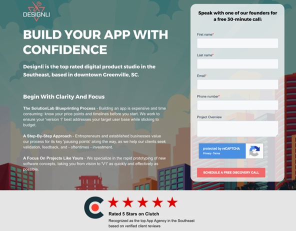
Email capture landing pages aim to get the website visitor to submit their name and email. This is so businesses can grow and leverage email lists. Why are email lists important? With an ROI of $42 for every $1 spent on email marketing, email capture landing pages, such as this example from Designli, are profitable tools in a marketing strategy.
The reason why email lists are so profitable is that, unlike social and search channels that are manipulated by algorithms that are out of your control, email is a direct line to your audience. Because of this, email marketing is one of the most effective ways to speak directly to potential and existing customers, whether on the whole or in segments.
Lead generation
Lead generation landing pages aim to capture as much personal information about the visitor as possible. With this information, you can get hyper-specific with your advertising and offers later on in the buyer cycle.
For example, if you capture information about a potential buyer’s age, likes or dislikes, and goals, you can send them personalized offers that align with specific products or services that you offer. A parent with a full-time job will likely have less time in their day than a young adult with a part-time job and no children. Therefore, their customer needs and journeys may differ, thus your offering needs to speak to their unique viewpoints (if possible).
That said, getting people to hand over their personal information is trickier than getting an email and thus requires a different approach. A clickable quiz or a personalized test is a favored tactic, as you can see in the below example on Jeremy Ethier’s Built With Science landing page:
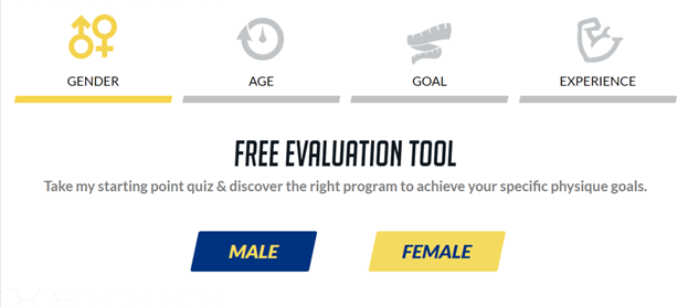
This ‘free evaluation tool’ works to collect all the information required to help the potential customer “achieve your specific physique goals”. Similar to the example above about different life experiences, this landing page hopes to capture different physical goals.
Based on these answers, they can nurture the customer towards purchase by targeting them with specific information that aligns with their unique needs and experience.
Direct purchase
If your business has shorter buyer cycles, your landing page will likely be aimed at making a direct sale. Direct purchase landing pages build urgency and excitement around an offering, then convince the visitor to purchase based on a sale or limited opportunity.This landing page from Munchery is a perfect example of a direct purchase landing page:
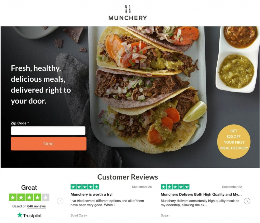
Here’s what it does well:
- Incorporates a stunning hero image that takes center stage. The meals look irresistible, and they make sure not to overlay any text over the main event (perfectly apportioned tacos).
- The benefit is impossible to miss: “Fresh, healthy, delicious meals, delivered right to your door”.
- They include a tempting discount which states that you get $20 off your first meal delivery. This incentivizes people to make a purchase or otherwise miss out on a great deal.
- They include a Trustpilot score alongside several 5-star customer reviews which acts as social proof. This helps to build trust, answer FAQs, and get ahead of any barriers to purchase; all key parts of nudging a visitor to make a final purchase decision.
Inform
Inform landing pages aim to convey information as succinctly and effectively as possible. About us, pricing, and 404 pages are all inform landing page types.
Take this pricing page from Salesforce.com’s Sales Cloud product as an example.
First, they break down their four pricing plans based on “Essentials”, “Professional”, “Enterprise”, and “Unlimited”.
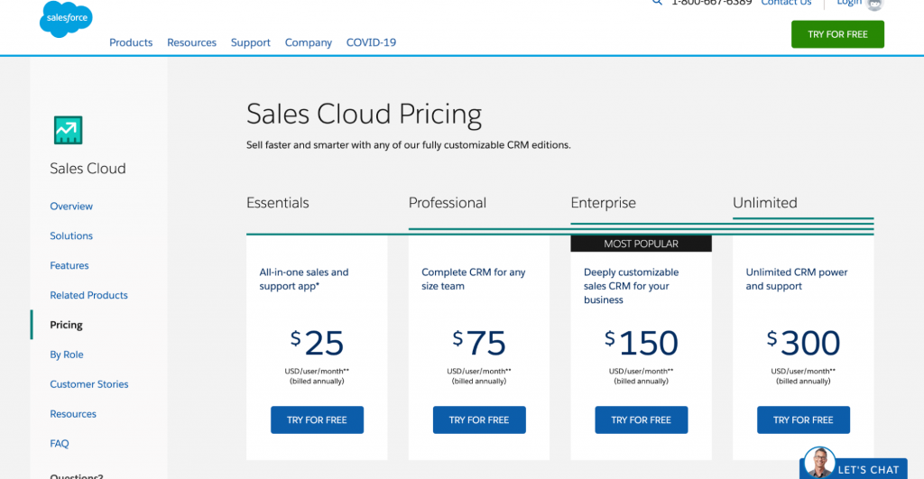
Immediately, you understand that the plans get more customizable and robust as the price increases. They also highlight the “most popular” plan, which is another form of social proof because it shows which plan is chosen most often by other customers.
Scrolling down, we then see a detailed feature breakdown which clearly shows what you get with each plan and why the prices vary from one tier to another.
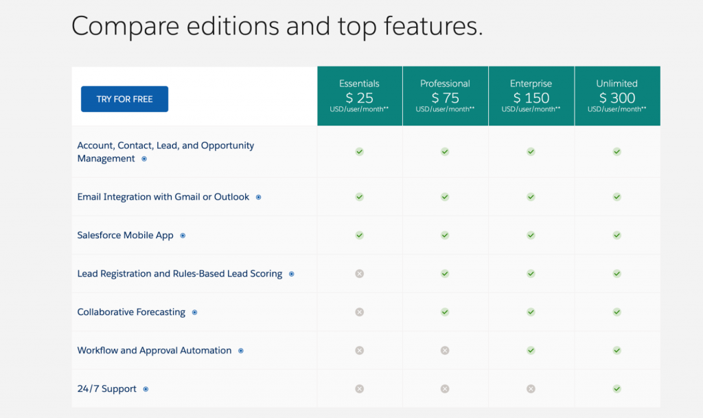
This does a great job of answering any questions the customer may have and also explains how the benefits vary depending on price.
At the end of the page, the customer can choose to explore even more features to compare which ones are included in which plan. They can also download comparison charts and view additional add ons in PDF format.
Finally, at the end of the page, they offer up answers to FAQs and offer various ways (phone, email, chatbot) to get in touch with a sales representative to learn more.
This pricing page is a masterclass in how to explain what features and benefits a customer will receive based on the price they pay for your product or service. It answers every possible question ahead of time and then offers several avenues to learn more.
Creating your landing page
Armed with your goals and chosen landing page function, it’s time to take a deeper dive into the essential landing page elements.
As you examine these functions, consider the design and language you will use for each. Your brand design elements should heavily influence your landing page design to ensure that your business is easily recognizable and consistent across all mediums. And as we touched on above, your target audience will heavily influence the language you use.
Hero shot
The hero shot lives above the fold and is what your visitor first sees when they arrive on your landing page. It should contain branding and imagery that immediately resonates with your target market and thus captures your visitors’ attention.
This moment is key because people make decisions on whether to stay and scroll or click away in a split second.
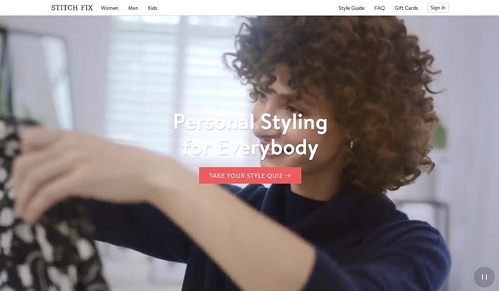
Take Stitch Fix’s hero shot as an example. It shows a fashion-conscious male unboxing new clothing. This speaks directly to Stitch Fix’s target audience while also demonstrating the service they offer.
As you consider the hero shot for your landing page, make sure everything speaks directly to your customer. Further, ensure that the hero image and copy tie back to any ad imagery and copy that drove traffic to your landing page.
If you are running multiple ad creatives or targeted email campaigns, you can alter the hero image and copy based on your intended audience. This helps to personalize your branding and messaging to suit the various customer segments that are driven by various motivations and benefits.
Also, consider load time. 40% of people will abandon a website that takes more than three seconds to load, and 47% expect a landing page to load in 2 seconds or less.
To ensure your hero image loads quickly, make sure that it’s properly sized, optimize it for mobile so that it loads accurately on all device types, and compress your image to the smallest possible size (without sacrificing pixel quality).
Value Proposition
The value proposition starts to answer the question “does this business understand my problem?”. It is a single sentence that surmises your business’s offering. It must capture your brand’s essence and clearly say to your target audience, “we do this for you”.
Ideally, the value proposition should be no more than seven words, and in most cases, the shorter, the better.
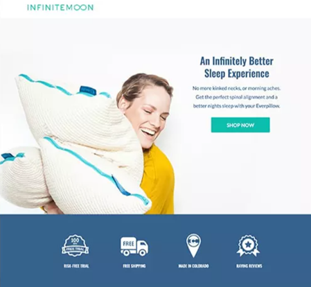
Consider this five-word value proposition from Infinite Moon’s landing page: “An infinitely better sleep experience”.
Immediately, a customer knows what they will get and what the business is selling. Your value proposition needs to do the same.
Explainer
The explainer is an expansion of your value proposition. It demonstrates that you not only understand your visitor’s problem, but you can also solve it.
This too should be succinct; no more than two or three short sentences that back up your offering and hones in on the benefits.
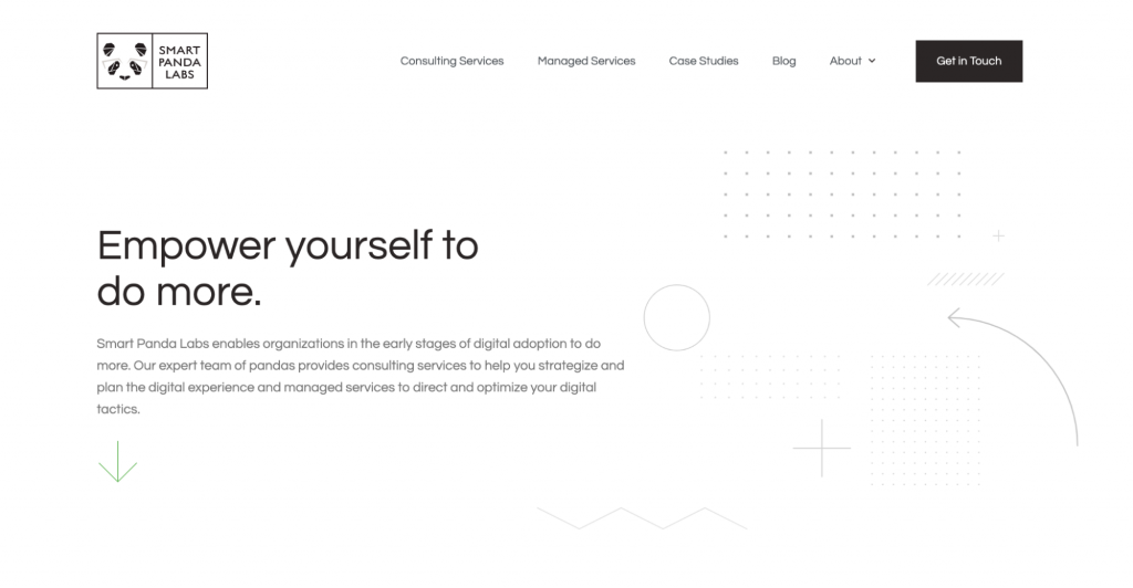
Our explainer at Smart Panda Labs specifies what we do and who we do it for.
- Who: Organizations in the early stages of digital adoption
- What: Consulting services to strategize the digital experience
- Benefit: Direct and optimize your digital tactics
Quantitative and qualitative social proof
The hero shot, value proposition, and explainer all serve to answer the questions:
- Does this business understand my problem, pain points, and goals?
- Can they solve my problem and deliver on my needs?
- Have they solved a similar problem for someone else?
- If so, how, and can it be proven?
With quantitative and qualitative social proof, you can answer these questions and prove that your value proposition works.Quantitative social proof is numbers, statistics, and case studies, whereas qualitative social proof is testimonials and reviews. Using a combination of both is the most effective strategy, as Fender Play shows us:
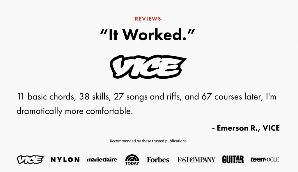
These examples demonstrate quantitatively the amount of engagement the platform receives from other customers. It also qualitatively backs up these statistics with a happy customer testimonial. Both sets of proof work to back up your value proposition and build trust.
Call to Action (CTA)
The final element of a high-converting landing page is a clear call to action. All the other elements on your landing page are geared towards encouraging your visitor to click on the CTA.
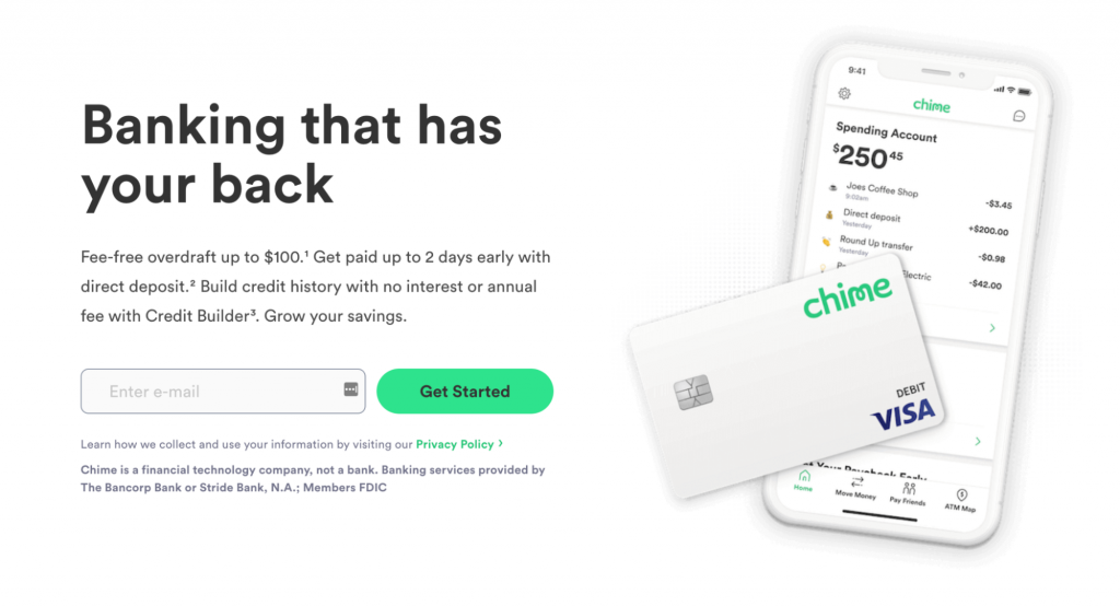
Your CTA will depend on your landing page’s function (which you determined during the conceptualization stage of the development process). Suppose, during conceptualization, you decided your landing page’s function was to gather email addresses. In this case, your CTA might look something like Chime’s “Get Started”.
If you’re aiming to collect qualified leads with your landing page, your CTA might look something like Vancouver Island University’s “Sign me up!”:
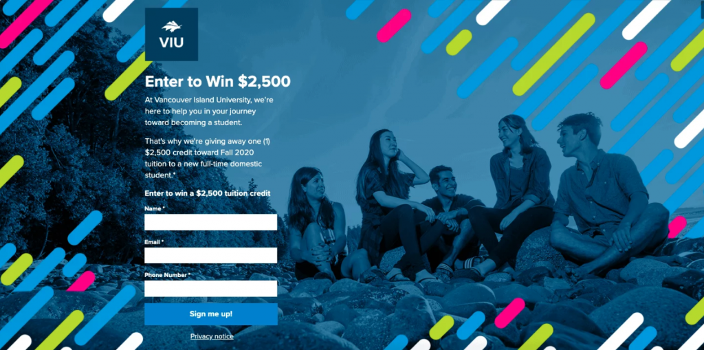
It’s unlikely that someone who is not interested in being a student would sign up for a credit towards the fall tuition. Thus, the leads captured from this giveaway will likely be highly qualified.
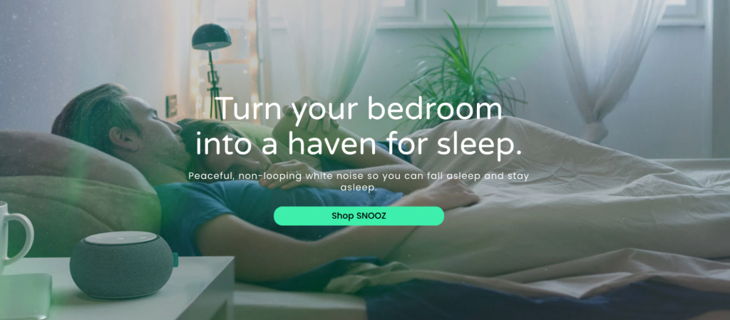
Or, if your objective is a direct purchase, your CTA might be something more like Snooz’s “Shop SNOOZ”.
As you can see, every single element on an effective landing page works towards the CTA.
If you include each of these elements in your landing page, you’ll be well on your way towards creating a landing page that converts above the average 2.35%.
After creating your landing page, it comes time to launch it. But this is far from the end of your landing page development process.
Post-launch and optimizing your landing page
You should treat the first version of your landing page as a test launch. The real benefits come from consistent post-launch analysis and optimization.
This mindset prepares you to collect data, analyze it, and then optimize your landing page according to what is going well and what needs enhancement.
Data gathering
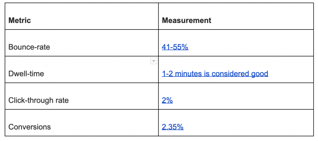
The data metrics that you should collect for your landing page include:
- Bounce-rate. The number of visitors landing on-page and leaving without clicking on a link. This metric is a good indicator of how effective your top-of-funnel is at attracting relevant traffic. The lower, the better.
- Dwell-time. The amount of time a visitor spends on your landing page. This helps gauge how captivating your landing page is and whether your top-of-funnel is attracting the correct customer type. The longer, the better.
- Heat mapping. This metric tracks your users’ mouse movements over your landing page. It helps to show where their attention is being drawn.
- Click-through rate. The number of visitors who click on an on-page link and where they go to. The higher, the better.
- Conversions – What percent of visitors engage with your CTA. The number of conversions is the ultimate yardstick by which you measure your landing page’s success. The higher, the better.
One of the best ways to collect these metrics is to install and configure an analytics tool such as Google Analytics on your landing page provider. An analytics tool constantly monitors your landing page and gathers the data necessary to calculate these metrics.
Data analysis
Once you’ve collected your initial round of data, you need to assess your metrics against industry standards to see how well your landing page performs.
Across-industry averages for these metrics are:
Once you have enough traffic see how your metrics measure up against industry standards. You can then get an idea of which elements you need to optimize.
Optimization
Optimization is probably the trickiest part of developing a high-converting landing page. It’s also the most valuable.
Optimizing your landing page for conversions requires a strategic approach. You’ll need to first learn what isn’t working well (from analyzing data such as heat mapping), then test new features, formats, placements, copy, and so on in order to see what, if anything, performs better.
Split testing
Split testing is a form of A/B testing that pits two (or more) variations of your website against one another. The goal of split testing is to gain insight into customer behavior in order to increase conversion rates. You do this by optimizing your campaign’s individual features, one at a time.
At Smart Panda Labs, we helped one of our clients, Viceroy Hotels and Resorts, conduct a split test of their own.
If you’re interested, you can read the entire case study. In essence, we created six different CTA buttons:
- Reserve
- Start Your Reservation
- Make Your Reservation
- Reserve Your Room
- Book Your Room
- Check Availability
After randomly presenting variants of the Viceroy reservations landing page with each of these buttons, ‘Check Availability’ had a far higher click-through rate and conversion rate, which, when implemented, increased room reservations by $30,000 per month.
Key takeaways
If you follow each step described in this guide, you’ll create a targeted standalone page designed for a single purpose that keeps the digital user experience top of mind.
As you begin developing a landing page for your business, keep the following in mind:
- Start by identifying what you want your landing page to achieve and ensure it aligns with your overall business goals, as well as your marketing objectives
- Only include essential elements on your landing page—nothing superfluous
- View your first landing page as the initial step in a journey of constant optimization, data collection, and testing—constantly update it to improve your landing page’s performance
READY TO PROVIDE A BETTER POST-CLICK EXPERIENCE?
Get insights and tips to drive more business from less ad spend, more profit from less cost, and more customer value from less churn.