Small Step For Conversion, Giant Leap For UX
Now, it’s my turn.
As a specialist in user experience (UX) and content strategy at Smart Panda Labs, I have developed a close relationship with testing. This invaluable strategy places data at the heart of digital decision-making, providing insights that inform all kinds of choices. For example, the test I’m about to share with you was not designed to focus on your typical testing metric, conversions, but rather to understand how design changes can measurably impact the way customers interact with a user interface.
50 (ok, 2) Shades of Grey
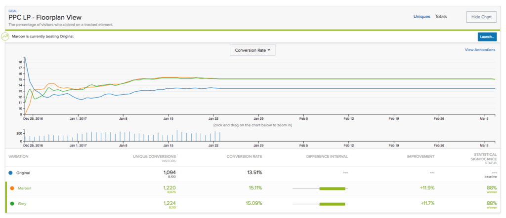
A large real estate client had a series of landing pages, designed by a third party, showing floor plans of available luxury apartments. The landing pages were clean and minimal, and a series of numbered circles indicated how many floor plan options were available to view. However, while a medium grey represented the active floor plan, the circles that represented the subsequent plans were presented in a lighter shade of grey. When the client asked us to improve the design to help increase user interaction, we immediately gravitated to the circles.
We felt that the lack of contrast between the circle that represented the floor plan being actively displayed and the other circles was not enough; the minimal contrast made it seem as if the circles weren’t clickable and instead merely visual cues of the number of available floor plans. We pitched a test to see if greater color contrast would achieve the desired goal.
It’s important for me to mention that we didn’t want to measure the effect this change had on the time users spent on the site, as time on the site can be both good and bad (they can be spending more time because they are engaged or because they are confused and searching!). So, we focused purely on interactions—were they or were they not looking at all the floor plan options?
Baseline
Variation 1
Variation 2
We tested the original floor plan module design against two new variations that each created more contrast, one using a slightly darker shade of grey and one that incorporated a maroon color. This test rapidly showed that the darker grey and the maroon were outperforming the original. Interestingly, the new variations were a dead heat with each other, showing almost a 12% improvement over the original. Users were clearly more likely to view additional floor plans when there was less ambiguity.

This test demonstrates how testing can be used not only to optimize for conversions but to help solve creative problems, like UX design and user interaction. A simple change, paired with a deliberate testing strategy, can help make the subjective objective and inform future design decisions. A test like this can also help make the case for simple and relatively inexpensive optimizations that help improve an experience, perhaps while other large scale changes are in progress or when there’s little time or resources.
CRO and UX Go Hand in Hand
The moral of the story: small changes are easy to test and can lead to significantly more engagement and, therefore, a better overall user experience. These improvements can make a site or campaign more intuitive to the user’s needs and a user journey more enjoyable. This approach, in turn, can prove to be a great supplement to your CRO efforts. In other words, focus on the person and all else will follow.
Key Takeaways
- Use testing to help make subjective decisions. Allow the visitor’s opinion to carry the most weight.
- People need to have a good experience before they can make a decision or convert. Use testing to optimize not only the decision but also the experience.
- Make sure the goals of your test are clear and unambiguous—don’t test for results that could be misinterpreted.
READY TO PROVIDE A BETTER POST-CLICK EXPERIENCE?
Get insights and tips to drive more business from less ad spend, more profit from less cost, and more customer value from less churn.