Beautiful Websites Must Convert
I’ve lost count of how many big-budget websites I’ve seen fail miserably at their primary job: selling products.
You know the type.
Gorgeous typography. Pixel-perfect visuals. Slick animations that wow the boardroom.
But the CTA button stays silent.
Ads drive traffic, but visitors leave without a second thought.
No leads, no sign-ups, no sales.
Just disappointed execs asking why their shiny new investment isn’t making them any money.
Looks ≠ effectiveness
Now, don’t get me wrong. I love a well-crafted, visually striking website as much as the next marketer.
But I also know aesthetics alone won’t grow a business.
Without a strategic approach to conversion, your website is nothing more than an expensive digital brochure.
At best, it’s forgettable.
At worst, it quietly drains your marketing budget.
After all, every day your site doesn’t help you hit your conversion goals is another day of wasted spend.
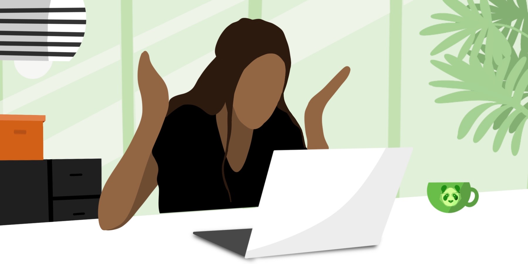
Think of your website like a retail store…
🐼 A beautiful window display means nothing if no one walks in
🐼 Shoppers won’t buy if they can’t find the products they need
🐼 Ignoring customers who show interest is a fast way to lose them to competitors
Your site works the same way. And that reality shows up in your acquisition costs.
Let’s say you spend $1,000,000 on ads that drive 100,000 visitors to your site.
- With a 1% conversion rate, 1,000 sales cost $1,000 each
- With a 3% conversion rate, 3,000 sales cost $333 each
Same traffic. Same budget. Triple the results.
What makes the difference in outcomes?
A website built to convert—not just impress.
What really separates winners from the rest in 2025?
The businesses that are thriving right now don’t all have the most visually striking websites. They have the most thoughtfully designed ones.
They have sites that welcome visitors with clear messaging, seamless journeys, and simple paths to action.
These awesome post-click experiences are an incredibly valuable form of customer-centricity.
They make buying easier. On a human level, they make people’s days better.
That’s more than just feel-good talk. The data proves that prioritizing people is a profitable business strategy.
For instance:
A Forrester study found only 3% of companies are truly “customer-obsessed”—meaning they put customer needs at the forefront of all business decisions (such as website design).
But those rare organizations are miles ahead in the revenue race, with:
- 41% faster growth
- 49% faster profit gains
- 51% better customer retention
So, the way I see it?
Having a people-first website is an absolute no-brainer.
3 essential elements of people-driven websites
Creating a website that both looks good AND converts well requires three critical elements working together:
1. Strategic design
Make your site attractive to your buying audience.
Think of it like dating: everyone’s got a “type.” You don’t want your site to be generally appealing—you want it to be exactly your ICP’s type.
Get to know their demographics, the media they consume, and the factors that influence their biggest purchasing decisions. Then, design a user experience to suit.
Imagine a home insurance firm targeting high-income homeowners. A conversion-focused site might include aspirational imagery and a sophisticated, uncluttered design. It would emphasize high-touch, personalized service instead of outlining the basics of homeowner policies.
Want a perfect match? Design with your ideal customer in mind.
2. Clear, resonant messaging
Create content that addresses visitor pain points directly and communicates your value proposition in seconds, not minutes.
Picture a meal delivery brand opening with “No time to cook? Healthy meals in under five minutes.” It hits a precise pain point in just four words, then solves it in the following six.
3. Optimized conversion pathways
Design frictionless journeys from first click to conversion.
This means: strategic CTAs, simple forms, clear navigation, and effective follow-up systems.
Continuous testing is your edge here—it’s the only reliable way to find what works before committing big bucks. Learn more in our full guide to marketing experimentation.
You know who gets all this stuff right? Headspace.
The meditation app brand balances striking aesthetics with conversion effectiveness wonderfully.
The company’s spent big on its site’s look and feel, sure. But never at the expense of usability.
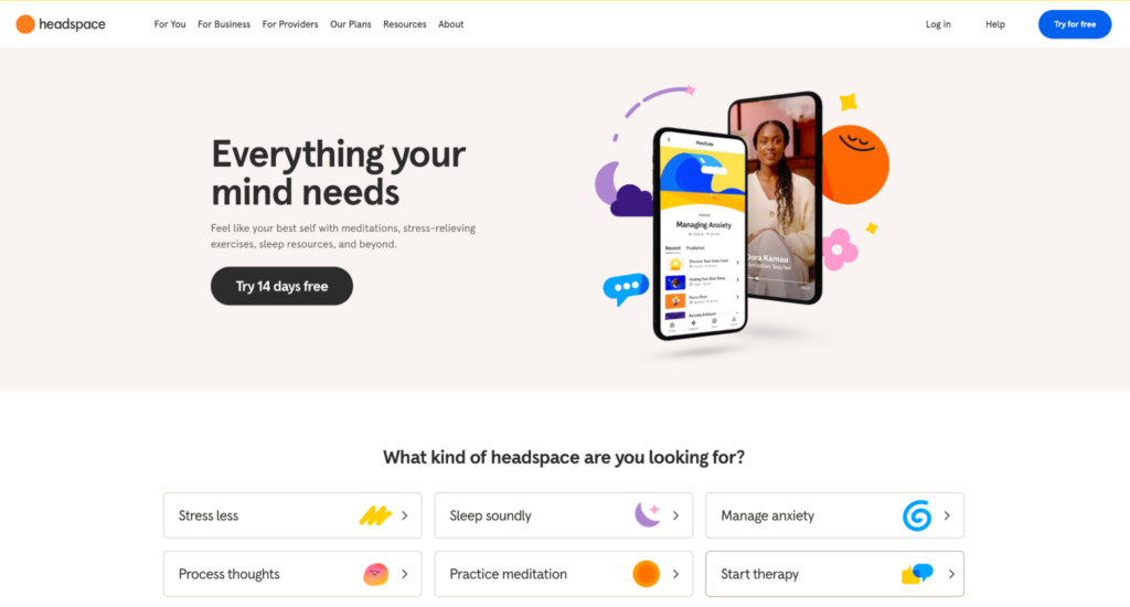
The question-based navigation (“What kind of headspace are you looking for?”) doesn’t just look good—it guides visitors quickly to relevant solutions.
Visitors can immediately choose stress reduction, better sleep, anxiety management, or other specific goals. They can subscribe—and become paying customers—in no time.
All this design serves the buying journey rather than forcing users to navigate artistic but confusing experiences.
A striking, memorable sight is never far away…
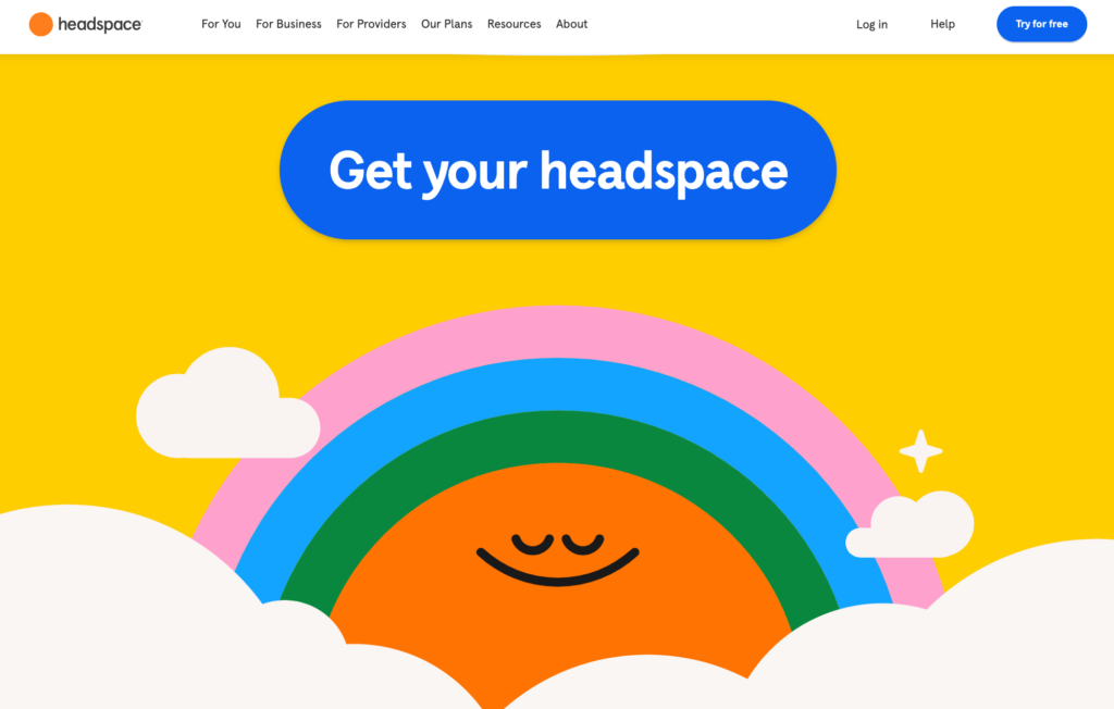
…but ultimately, the clear pathways—from super-specific need to a carefully refined solution—turn aesthetic appeal into almost $350 million of tangible business results.
Is your website earning its keep?
Your website should be your highest-performing sales asset, not just a digital trophy on the marketing shelf.
To drive real results, it must do three things flawlessly:
✅ Be attractive to the right audience
✅ Speak to their needs with precision and clarity
✅ Guide them effortlessly from first click to conversion
Balancing those elements is how the biggest B2C brands win. Their websites don’t just look good—they work hard.
–Shamir
Smart Panda Labs helps B2C enterprise companies drive more revenue with less ad spend by planning, building, and managing post-click digital experiences. Click here to book a call.
READY TO PROVIDE A BETTER POST-CLICK EXPERIENCE?
Get insights and tips to drive more business from less ad spend, more profit from less cost, and more customer value from less churn.